
I’ve been busy, silently coding, having fun and discovering new and exciting visualization technologies both new and old. Since the last post, I’ve released version 0.8.0.6 of Dex which has a bunch of bug fixes and some new capabilities. I’ll hit some of of the highlights in this article.
UML
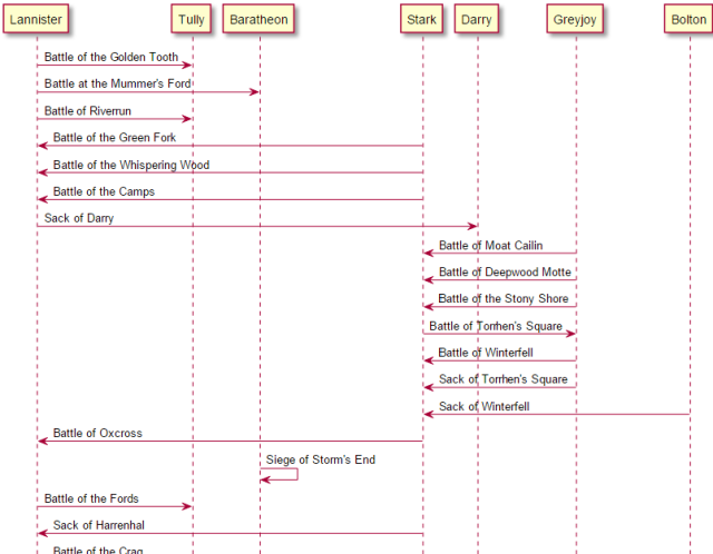
Recently, I had a need to quickly visualize some UML relationships and I discovered a visualization package called PlantUML. PlantUML is open source and comes in a variety of generous licensing options. However, using Dex with PlantUML will require an additional installation of GraphViz. However, it’s painless and well worth it.
As always, images link to a live version.
Here are the battles in the Game of Thrones visualized in a sequence diagram:
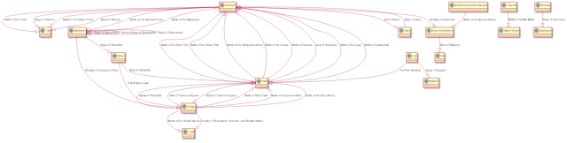
And here are the battles visualized as a class diagram:
Vis.js
I recently discovered an open source visualization library called Vis.js. Frankly it’s awesome. There is a lot of attention to details such as implicit pan, drag and zoom capabilities and it scales very well. It’s network diagrams lay out and behave arguably nicer than D3 visuals though I am still working some kinks out of hieararchical layout behavior.
The physics model behind them is spectacular, not surprising since the author, Alex de Mulder, has a degree in Applied Physics.
Less words, more pictures and interaction!
Network Diagrams
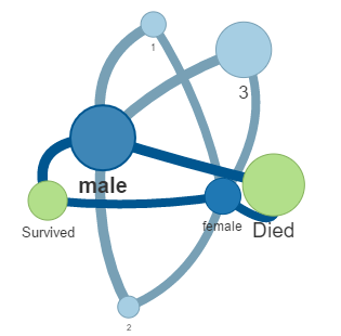
Now that VisJS networks are integrated into Dex, we can easily things like this:
Here’s a simple one where we take a dataset which records the survivors and deceased passengers of the ill-fated Titanic. We relate them by gender and passenger class. Nodes and link sizes relative to the number of passengers within each category.
Next, is a visualization of President/Party affiliations.
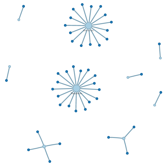
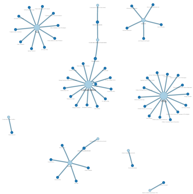
Let’s not forget about the UK visualization of Prime Ministers/Party affiliations:
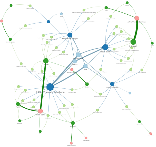
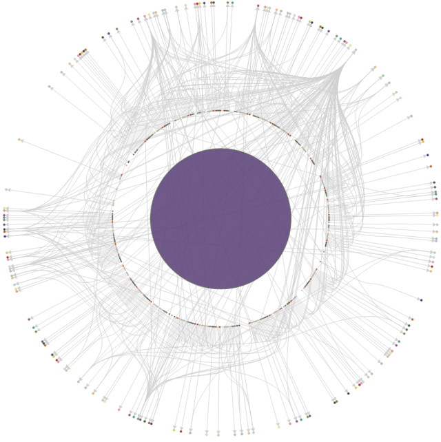
And next is a more complex and more hierarchical example relating the Game of Thrones Attacker King and Affiliation to the Battle and back again to the Defending King.
Timelines
Last but certainly not least is the Timeline. The timelines scale up to thousands of events and the zoom is amazing. It smoothly zooms down from centuries to decades to years to month/year to month/day down to discrete time ranges in the millisecond range. This is fantastic if you wish to view time sequence data at both a high and low granularity. Here are some examples:
Use the mouse-wheel to zoom in and out of the timeline and left-click/drag to move around.
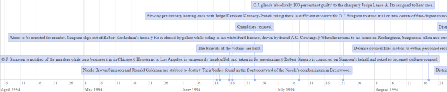
OJ Timeline
In the spirit of all the OJ specials coming out right now, here is a timeline of the OJ Simpson Trial.
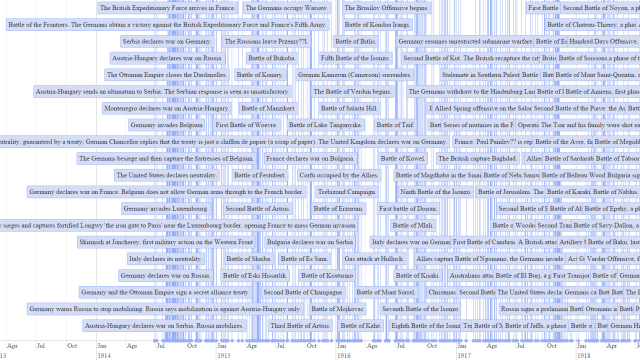
World War I Timeline
Hard to believe such a global tragedy began with a simple assassination.
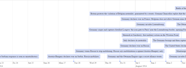
Another view zoomed out:
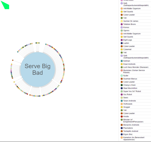
D3Plus Ring Networks
I find that I am really loving the D3 Ring Network’s ability to display only adjacent links. Here’s a Dr Who Network.
Tons of links converge at a miniscule node to the upper right “Serve Big Bad”, clicking it yields a node centric view which looks like:
Wrapping Up…
Anyway, that’s not it by a long shot, but it’s all I have time to discuss tonight.
