In this article I will discuss general styling capabilities within DexCharts using a tree or dendrogram as a base example.
The Basics
All DexChart visualizations follow the same basic process.
- Start an html page.
- Define any styling parameters.
- Include the necessary scripts. Typically this is d3.js, dex.js and whatever charts your visualization entails.
- Create an SVG to house your chart.
- Define some data to visualize in CSV format.
- Instantiate a chart instance.
- Render the chart.
A Simple Example Dendrogram
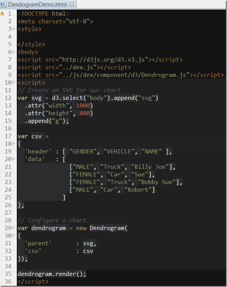
Lines 1-2 simply declare this document as HTML and a characterset.
Lines 3-5 declare any styling parameters. We’ll be styling things progmatically so we do not need anything here. In fact, it could be omitted entirely.
Line 6 starts the body of our HTML document.
Line 7-9 includes D3, Dex and the Dendogram chart into this visualization.
Line 10 starts our visualization javascript.
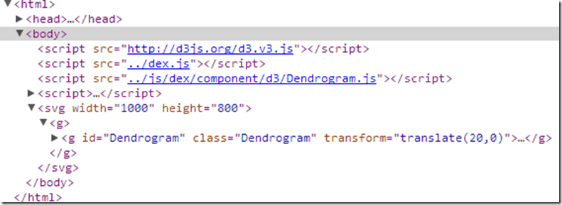
Lines 12-16 creates a new SVG appended or as a child of the body of the HTML page. The dimensions are 1000×800. We also append a graphics container ‘g’ as a child of the SVG.
The structure looks like this:
Lines 17-26 define a CSV dataset consisting of 3 columns and 4 rows. The data contains a series of records containing the Gender, Vehicle and Name of the person driving that vehicle.
Lines 29-33 instantiate a new dendrogram. We have omitted everything except for the bare essentials. The parent SVG graphics container of our chart and the data to be rendered.
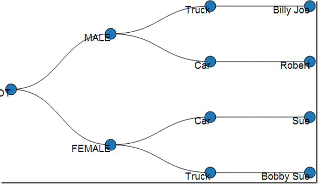
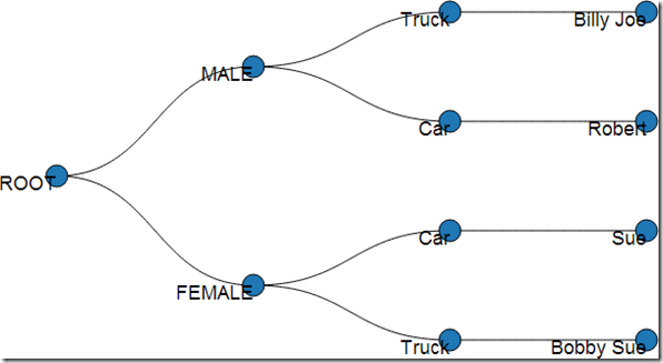
In line 35 we render the chart. It looks like this:
This isn’t quite right. However, it’s an encouraging start.
Offsetting The Chart Horizontally
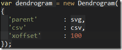
Let’s shift the chart over to the right by 100 pixels so that it doesn’t scroll off to the left of the container. So we add:
‘xoffset’ = 100
we get:
This is much better.
Differentiating Nodes
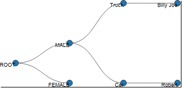
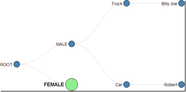
Now, when we collapse nodes, the result looks something like this:
I can’t tell that the female node contains children. Let’s do something about this. Let’s design a visualization plan for this:
- Fully Expanded Nodes
- steel blue
- 10 pixel radius
- Collapsed Nodes
- light green
- 20 pixel radius
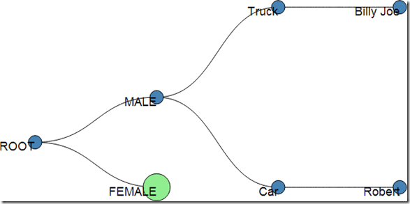
To achieve this, we simply add:
‘node.expanded.circle.radius’ : 10,
‘node.expanded.circle.style.color’ : ‘steelblue’,
‘node.collapsed.circle.radius’ : 20,
‘node.collapsed.circle.style.color’ : ‘lightgreen’
The results are satisfying.
Configuring Labels
It would also be nice to offset the labels from the nodes. Here we again have to cover the case of the expanded and collapsed nodes. The offsets will differ. Lets change the visualization such that:
- Expanded Nodes
- Normal font weight.
- Centered on the node so that the text does not overlap the node.
- Collapsed Nodes
- Bold font weight
- Centered on the larger nodes so that no overlap occurs.
The solution is:
‘node.expanded.label.x’ : -14,
‘node.expanded.label.y’ : -4,
‘node.expanded.label.font.size’ : 14,‘node.collapsed.label.x’ : -25,
‘node.collapsed.label.y’ : -6,
‘node.collapsed.label.font.size’ : 16,
‘node.collapsed.label.font.weight’ : ‘bold’
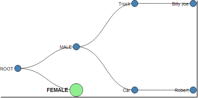
Which gives us:
Not too shabby, but we can do better.
Opacity and Strokes
In the previous example, the line connections are distracting when they overlap our text. Let’s resolve this by changing the color and opacity of the links.
‘link.stroke.color’ : “grey”,
‘link.stroke.opacity’ : .3
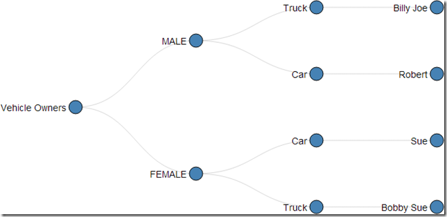
And we now get:
We’re getting there. But what’s up with the node called “ROOT”?!? It would make more sense if it were empty or called something like “Vehicle Owners”.
‘root.name’ : “Vehicle Owners”
Labels
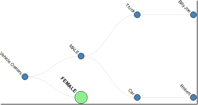
Sometimes values can be so long that there is not room to fit them horizontally. Let’s rotate our labels just for kicks.
‘node.collapsed.label.transform’ : ‘rotate(45)’,
‘node.expanded.label.transform’ : ‘rotate(45)’
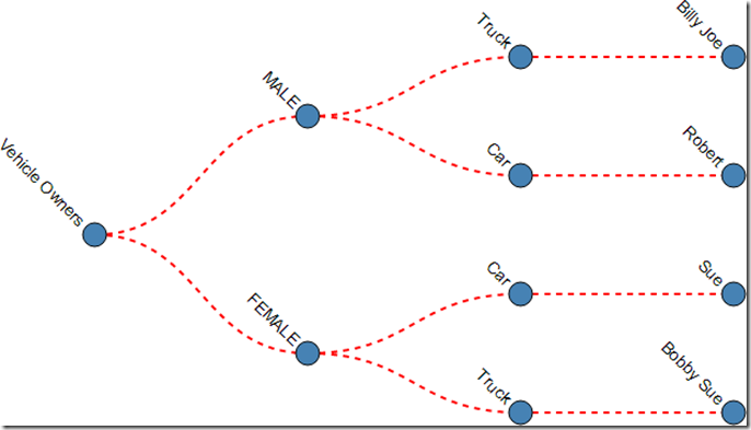
Hey, no more overlap with the links. Lets make the links more pronounced.
‘link.stroke.color’ : “red”,
‘link.stroke.width’ : 2,
‘link.stroke.opacity’ : 1,
‘link.stroke.dasharray’ : “5 5”,
Wrapping Up
Due to some fortuitous refactoring, all components will enjoy these same core configurable benefits. This will bring a large amount of configurability to the charts without much code or extra work. Since strokes are handled centrally, we can now apply dashed lines to Line Charts, Chord Diagrams, etc…and so on…
External Links:
That’s it for now…

