Mike Bostock is one prolithic mofo. I don’t know why it took so long to focus on this visualization (probably because there are so many other amazing ones out there), but Clustered Force is really a very nice visualization. I didn’t really get how nice this visualization really is until I started playing with it and extending it.
In this blog article we will explore what Dex can do with this visualization. I will try to make amends with Clustered Force for having ignored it for so long.
We will first focus on some artificial mathematical data in order to illustrate some basic capabilities. From there, we will branch out and explore a few datasets ranging from nutritional value of foods to the scores of football games.
A Mathematical Example
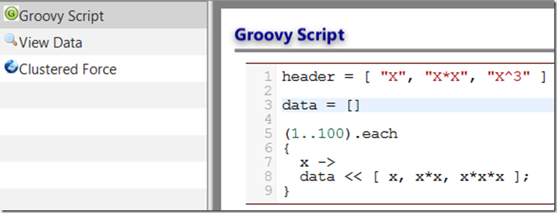
First we create a simple dataset with the following code:
This script creates 100 rows of three columns of data. The first column is called X and ranges from 1 to 100. The next column is “X*X”, which is the product of X multiplied by itself. The third column is X^3 or X to the third power.
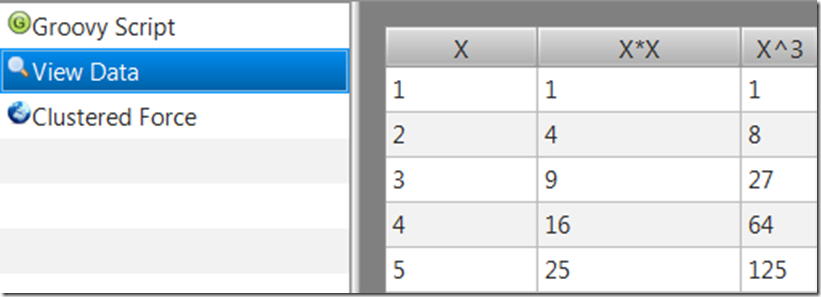
The beginning of the data looks like this:
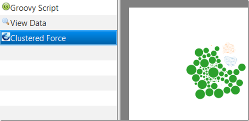
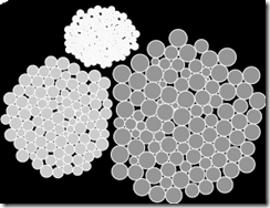
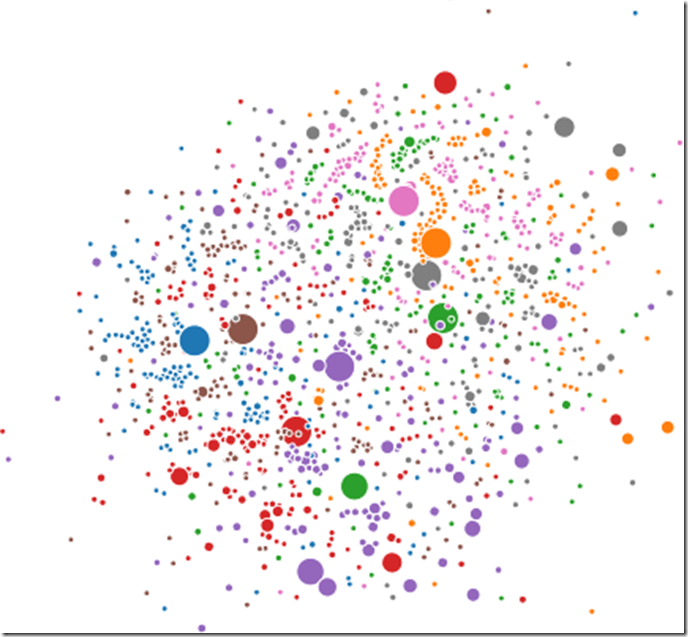
No surprises, X is incrementing by 1, X*X is growing exponentially, and the third column “X^3” is growing by a power of 3. When we feed this data into the Clustered Force visualization we see:
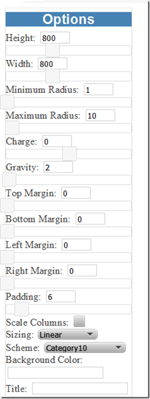
This visualization extracts the numerical data and scales each numeric circle across all of the minimum and maximum values across all of the columns. The following GUI is available to modify this behavior:
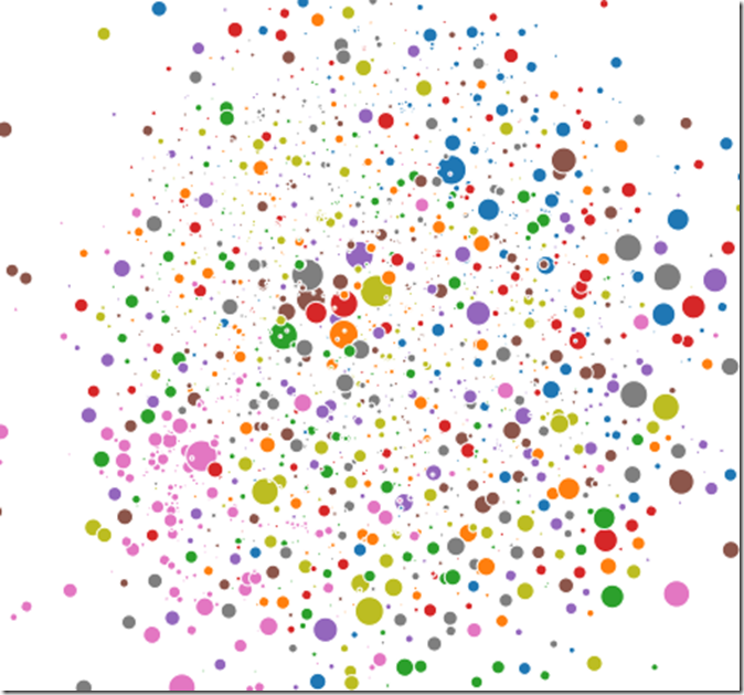
Scaling the dataset logarithmically, setting the background to black, and the color scale to black we get something which looks totally different:
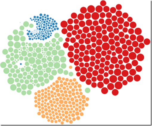
Changing the color palette once more and scaling by columns will size each column relative to itself. This will keep X^3 and X*X from obscuring relative ratios of X.
Sales Data
Next, we change the flow to read in some sales data. Feel free to explore the dataset.
Nutritional Information
Scalability is an issue with a large amount of data (> 1000 data points). Thresholds will vary with browser. Chrome runs much faster than the rest.
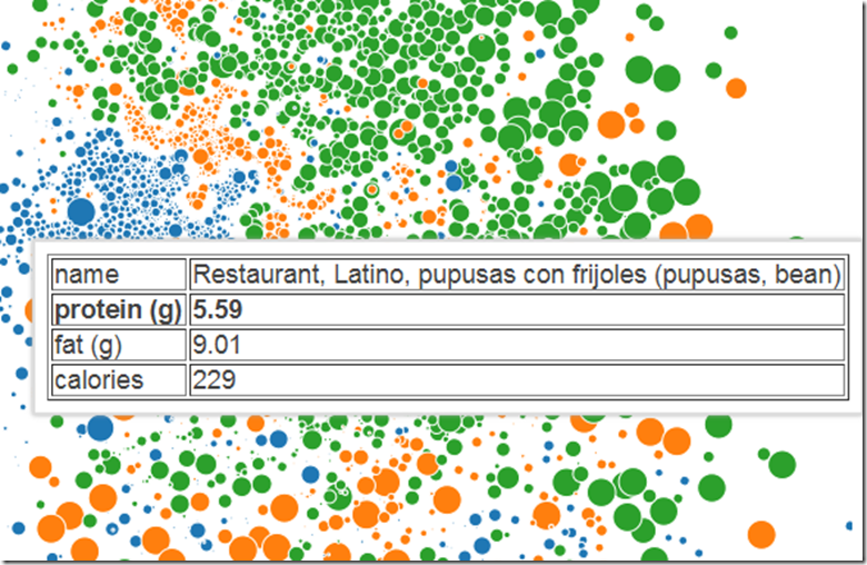
With this in mind, I have limited the nutritional information to 3 columns; caloric content, fat, and protein. As with most datasets, the data was sparsely populated so a bit of ETL with Dex was also required to do things such as replacing empty values with zeros, filtering unwanted columns and so forth.
This visualization is comprised of about 4,500 pieces of data, 3,300 of which become moving circles across the screen. The slowdown is noticeable, but it’s still usable on a high end PC.
Garbage Collection Data
This dataset contains my typical jstat generated data. It’s fun to explore.
Defense Budgets
This visualization shows defense budgets across the world.
Income Across the World
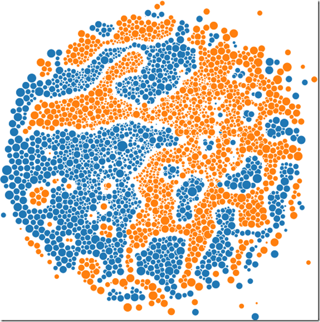
This visualization shows the per-capita earnings per household, normalized to USD in the Year 2000. Years determine color categories. The wide disparity across the world is evident.
American Football
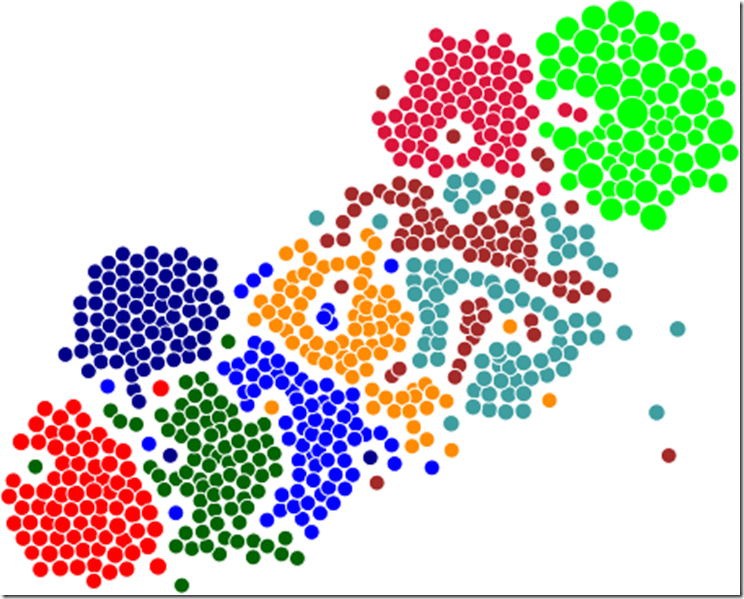
Last, and least, here are some football scores from 2012.
Until later…

